The challenge
We were asked to create branding for the Emergency Services Network, a new critical communications system that would be used by over 300,000 emergency service workers in Great Britain, including ambulance and fire and rescue teams. We knew the brand needed to be simple, straightforward and digital-focused, reflecting the system’s ambition of being easy and intuitive to use in high-pressure situations.
Our solution
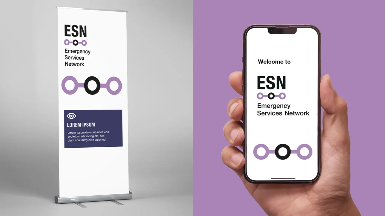
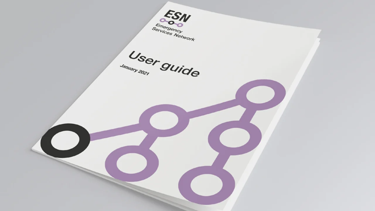
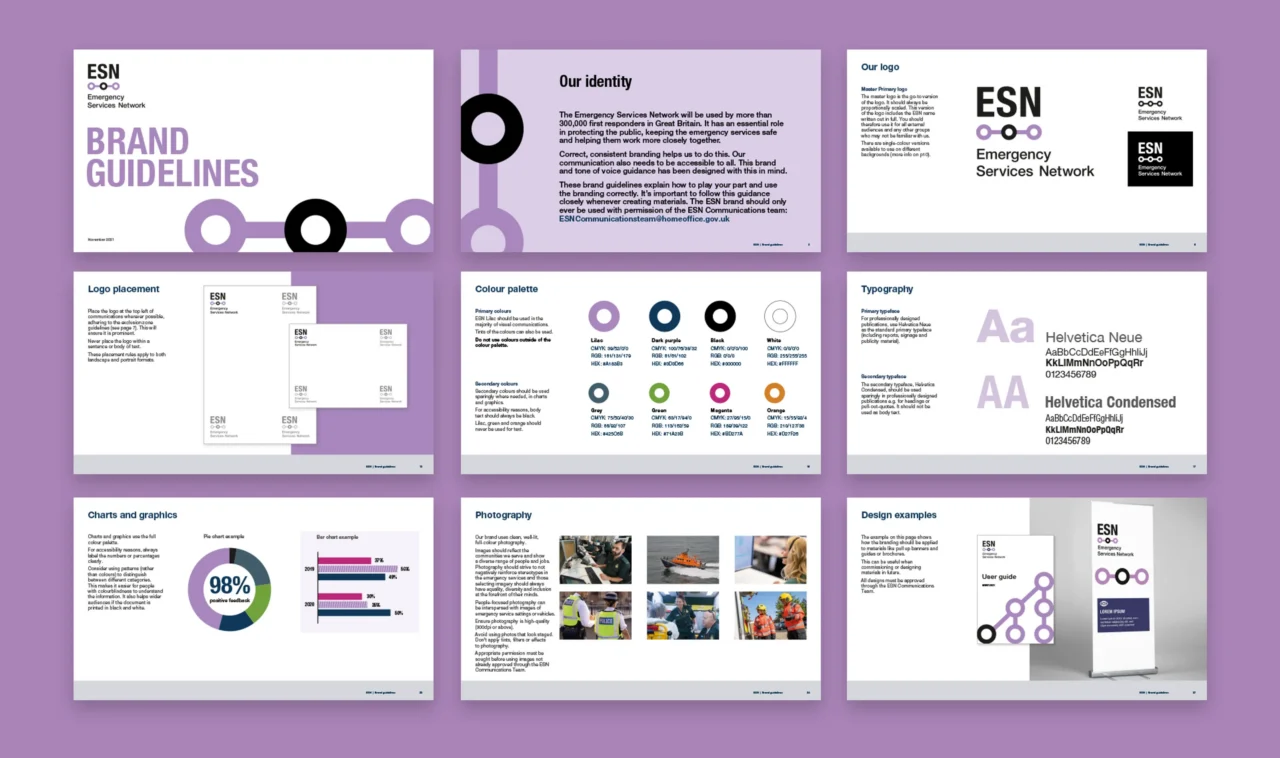
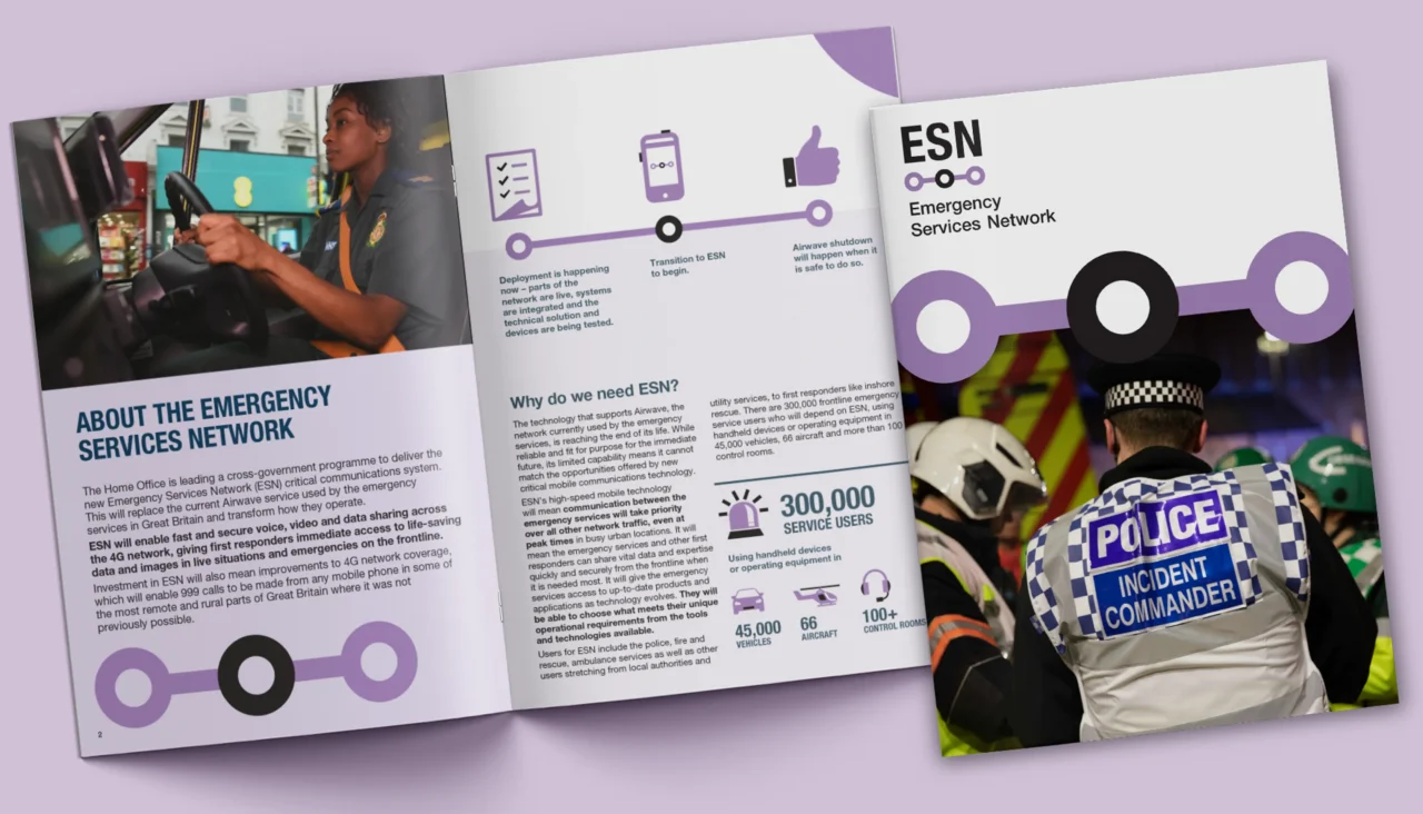
Prioritising clarity and simplicity, our branding brings the Emergency Services Network’s role in keeping workers connected to the forefront. Straight lines and rounded shapes join up to represent direct communication, collaboration and teamwork. This clean visual approach helps users navigate the system and find information quickly, supporting their life-saving work.